 6 Episodic J-Drama Recommendations
Spoiler Warning for The Untamed!
Hello everyone, today I’m bringing you a different perspective on drama (and movie) watching. In my last article, I spoke about how light is a tool to represent the mood, state of mind, etc. Today, I’d like to talk a bit about framing and blocking and how it can be used, specifically, to trick the mind into thinking a location is “full” and “crowded”, even if you only have a limited number of extras available.
While my last article used a positive example, in this case, I'll be using the negative example of The Untamed. The reason is simple—it's the drama that made me write this article! Whenever certain scenes came up, I couldn’t suspend my disbelief or contain my frustration. Scenes that were meant to have hundreds and thousands of people… felt empty. Having studied cinema, no matter how much I tried to ignore it, I could not. My mom suffered quite a bit as I kept stopping episodes to go up to the tv and show her with my hands how a shot should’ve been framed or said, “See, they should’ve never included this shot!”. For her part, she was a good sport, allowing my multiple interruptions and even agreeing with my sentiment (although with much less passion).
And so, I found myself unable to stop thinking of this. The Untamed was a good show for me—but it could’ve been a great show if the directors had been able to properly utilize the extras they had to create the effect of locations overwhelmed with warriors. Since these were such important events in the story, the fact that I couldn’t believe them affected my enjoyment. And so, this is how this article came about. The basic gist of this article is that I’m going to give an overview of where the show went wrong and what they could’ve done differently.
Let's begin!
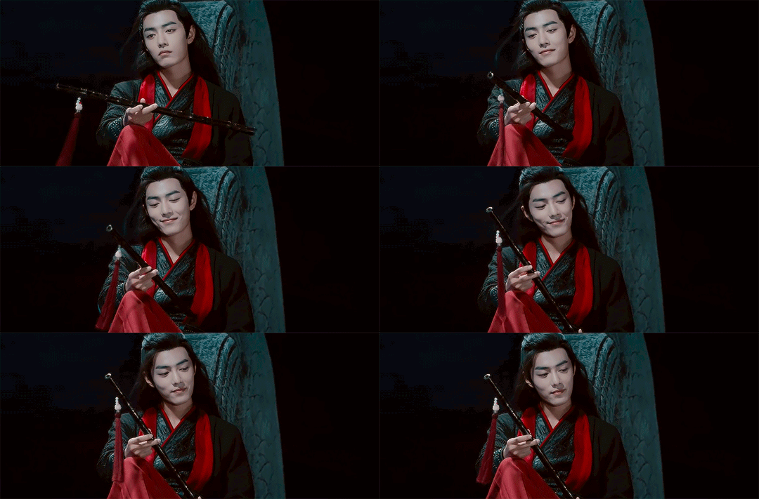
Let's take one of the most blatant examples I can. At a certain point, The Untamed tells you that Wei Ying killed 3,000 people in the battle in Nightless City. So far, so good. But what the show actually shows you is a battle against maybe 150 people — and even these feel less than because of how the show frames and positions them.
To better understand why this is, let's take a quick look at the unspoken rules The Untamed broke and the rules they should've followed:
What to Avoid
Rule #1: Never let your audience know how many people are in a scene!
Rule #2: Avoid dead and empty space like the plague!
I don’t know why this happens – is it the directors being enamored with their set? Is it an attempt to make the shots more varied and dynamic? Is it because they’re pressed for time? Whatever the reason, it is quite unfortunate that The Untamed repeatedly and frequently makes these mistakes.
The first mistake The Untamed makes, and it's the most frustrating one, is repeatedly showing you exactly how many people are in the space. This is about the biggest possible no-no when you're on a budget but need to convince of a certain narrative because once the brain knows… it can’t unknow anymore.
But that's not enough—The Untamed doesn't just show you how many people are in a scene; it also shows you how underutilized the space is.
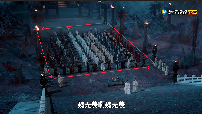
Look at this shot. Can you, in any way, shape, or form, convince yourself these are 3000 people? You don't need to answer that - the answer is obvious. You can't. There is no room for imagination here. Now, I don't know if you'll immediately jump to around 150 people. Fact of the matter is, I didn't! I thought it was far less because of how underutilized the space is! It dwarfs the people, making the number feel small and insignificant. This perfectly demonstrates why these are such enormous mistakes from a filmmaking perspective.
And The Untamed doesn't do this once, doesn't do this twice— it does so for the majority of the shots in this scene.
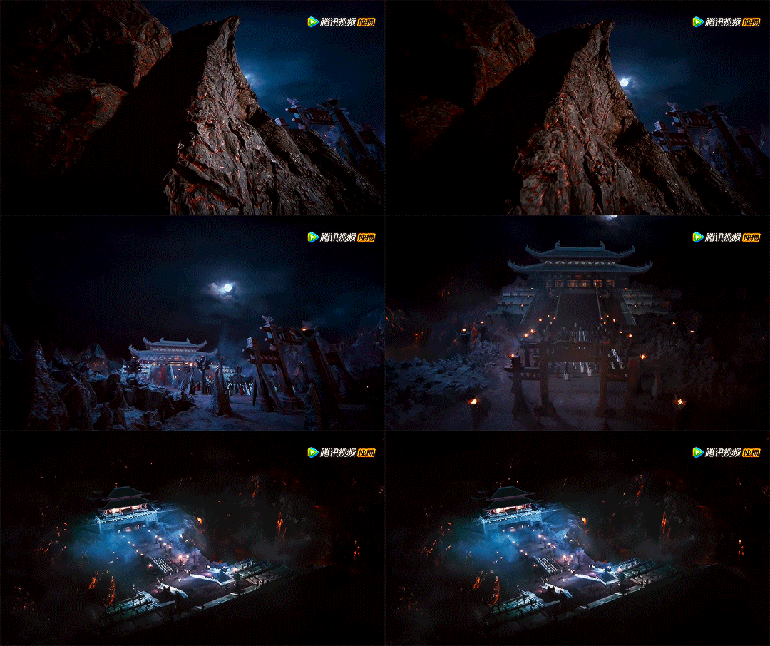
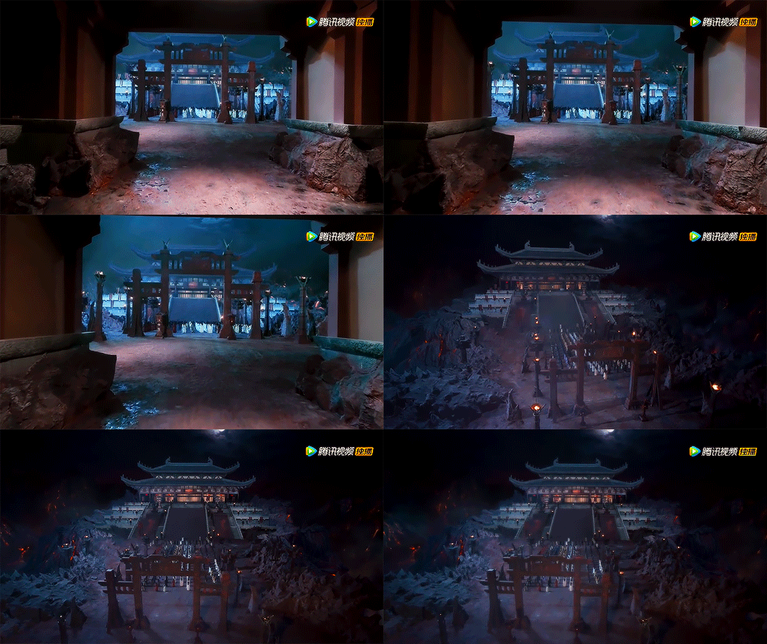
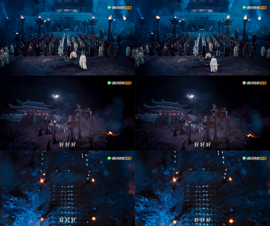
Why, why, why are you so obsessed with showing me exactly how many people there are? Why are you so enamored with the dead space? How am I supposed to see these and then believe you when you tell me these are 3,000 people!?
Now, you might be wondering, what should they have done?
What to Do
Rule #3: Always use shots that imply there is more than you can see!

Rule #4: Use busy shots overwhelmed with people!
These two rules are all about tricking your audience into believing your narrative by basically using the power of imagination. The first is about tricking your brain into thinking that what you're seeing is only a fraction of what's there, and the second is about tricking your brain into thinking there are a lot of people there—so many that they overwhelm the shot. So long as you don't contradict this information with shots like we showed in the previous part, this is a very effective tool.
Small Exercise
Let’s do a small exercise to better understand the last two points.

The original shot shows a lot of empty space, and you can clearly see the exact amount of people in it. It’s about 25 people, but of course, your brain will round it up on a casual watch. Now, let’s say I want to convince you there are actually a lot more than 25 people in this shot, but I only have 25 people available. What can I do?
Well, take a look at the second shot. This is the exact same shot, cropped differently, not a different shot from the series. Doesn’t it feel completely different? It looks a lot fuller, a lot more crowded, right? I made sure to leave as little empty space as possible while cutting off people to the sides. Why? Because your brain knows these people are not actually cut in half, so your brain already understands “body parts are hidden outside the scope of the shot”. Now, if you tell it, more people are standing to the sides of the shot; it’s not a leap for it to believe it. These types of shots support the illusion you’re trying to convey.
Now, granted, the shot I created is not perfect by any means. These shots need to be planned out so you can position the bodies in-shot in the best possible way. Was The Untamed calculated and careful? Not by a long shot. The sad part is that while it would've most likely taken more planning and attention to detail to do this, it would have most likely been at no additional cost.
In fact, they could've gotten rid of most of the expensive and fancy long-shots (especially those that use cranes!) in favor of a couple of well-thought-out establishing shots such as this one:
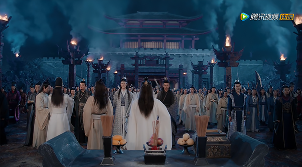
The angle of this shot is more or less eye-level. Why is that important? Because it doesn't reveal the dead space shots from above do! Instead, it creates a fantastic effect of a sea of people standing behind the sect leaders. The only way this shot could've been better is if they positioned the people on the left a little tighter, but that's really being nitpicky at this point (although I'm sure some of you think this entire article has been nitpicky).
After getting rid of those fancy long shots, all that's left to do is to replace those with many busy medium shots or full body shots that are tightly framed. Make it appear as if there are so many people it overwhelms the shot while always cutting people off to the side to imply that there are so many people they cannot fit within the frame.
Then, if you do these, when Wei Ying or the sect leaders throw around numbers in the thousands, your brain is going to believe it!
These same principles are also crucial for fight scenes. Especially when one character is searching for another character in what is supposed to be a "crowded fight" and can't find them, only throughout the whole thing the gap between fighters should've definitely allowed the characters to meet since their line of sight is completely unhindered. Not going to lie... I laughed. Actually, that was a lie. I was more upset than amused because I kept being preoccupied with how badly one of the most emotional scenes in the series was shot.
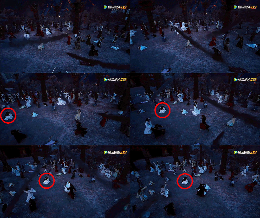
We go back to the whole point of it being empty and underutilized. You can hardly believe they couldn't see each other, and moreover, you can't convince me this is a fight with 3000 warriors. What could they have done? Easy. First, no cranes. Don't show me a scene from above if you can't fill every nook and cranny with warriors so it looks like they a) couldn't see each other previously and b) that thousands of people are fighting. Instead, use medium shots and close-ups on the characters, where the background is overwhelmed with people to create a boxed feeling and a sense of having to push through to find and get to someone. And voila! You get an excellent scene filled with dread and fear.
A little caveat
While this article criticized The Untamed, I'm only using it as a tool to bring my point across and teach a bit on things to do and not do when trying to create a certain effect from a filmmaker's perspective. Most likely, when you watched the show, it didn't bother you half as much as it did me, and the rating for The Untamed speaks for itself - it has captured the hearts of so many people (me included), even without optimizing their shots.
In fact, despite the extreme way I presented it previously, there are probably a lot of mitigating circumstances when it comes to The Untamed. The show may have had to position 4 or 5 cameras shooting at the same time around the arena to save time and money, and this may be why shots are so underpopulated - because they had to contend with showing people in several different angles but didn't have the manpower to properly fill those shots. The angles of the shots can also be a direct result of this (in order not to show the other cameras and cranes in frame). So, what I’m describing could’ve been a lot harder than I’m presenting it in practice. This is more of a theoretical exercise,
So, please don't take this as me hating on the show. I am merely sharing a different perspective on drama watching, with the hopes of giving you something new to think about as you watch dramas in the future~
(シ_ _ )シ
