par ureshii, juin 24, 2023
25


Upcoming Summer (2021)

HELLO, MDLers!

I feel like cinematography is a really underrated part of films, especially on Mydramalist. It’s always only briefly touched on in reviews and rarely talked about in general, as evident from the lack of articles and lists on the topic. Of course, the execution of the plot, writing, and acting is undoubtedly one of the most important aspects of a film, but without cinematography, it doesn’t always feel complete.

A film isn’t complete without cinematography and if a director has put thought into its intricate details, whether it’s visually stunning skylines or the beauty of delicious food, it all ties into the creation of a good quality film.

For some, the cinematography is a defining factor of a film. The plot could be simple, boring, or straight-up bad, but if the cinematography is beautiful, you would want to continue it, right? Maybe? It could even have the potential to become one of your favourite films. This has become the case for me on many occasions – which is no surprise.

Maybe I’m just terrible at researching, but I could not for the life of me find an article dedicated to aesthetically pleasing titles - that consist of both old and new releases. So, it was only right for me, as a previous art student and current cinematography lover, to hop on here and create an article about it, grouping each film into seasonal categories based on its visual atmosphere.

Whether it’s the film's toning and overall aesthetic or the emotions I felt while watching it, I present to you a list of films that wowed me with their visually stunning cinematography.

!! Please keep in mind that I am not a professional writer & simply making this article for fun + the titles & topics spoken about are my personal choices & opinions.

Easily navigate the article by its colour-coded categories

THE 4 SEASONS
SPRING: beautifulSUMMER: brightAUTUMN: colourfulWINTER: dark/cold

But first... Let's establish what an “aesthetic” film is!

Perhaps you’ve heard someone say, “The film has great visual aesthetics!" But you didn’t exactly know what they meant?

Well, in the simplest explanation, they meant the style, tone, look or mood of a film.

A feast for the eyes.
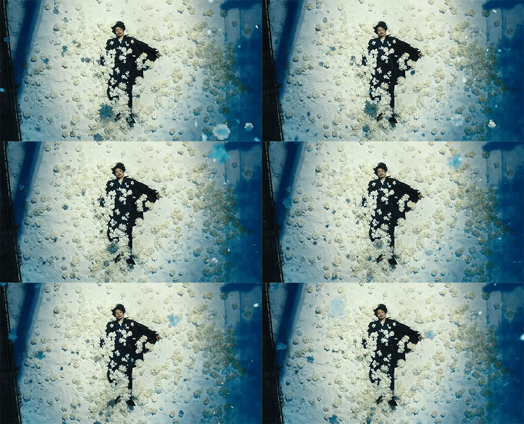
No Longer Human (2019)
No Longer Human (2019)It's much like how other forms of art and design have visual appeal in the various elements listed above - so too does a film.

Many of the same elements of art aesthetics that we understand in relation to a painting, can be analysed and reflected upon in film.

Why are aesthetics important in filmmaking?

Film aesthetics are important for various reasons, just as aesthetics are important in other forms of creative art. Directors incorporate multiple aesthetics in order to define the style, subject and tone of the film.

For example, a director might remove colour to utilise the qualities of a black-and-white film, portraying a bleak, hopeless style that aligns with the subject of their story. This director may apply similar aesthetics in the lighting and patterns to further enhance the film's dark and hopeless theme.
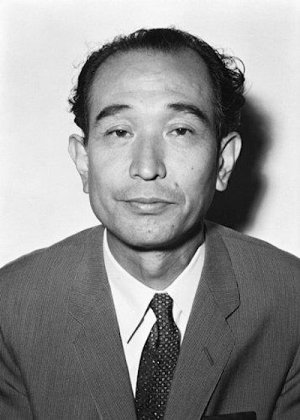
“There is something called cinematic beauty. It can only be expressed in a film, and it must be presented for that film to be a moving living work.” 

– Kurosawa Akira, Japanese film director and screenwriter

SPRING: beautiful

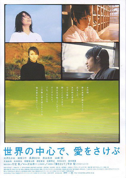
Crying Out Love, in 
the Center of the 
World (2004)

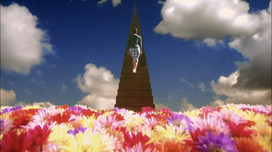
While Crying Out Love is beautiful in many ways, I would consider it one of the more subtle films on this list, in the sense that the more visually appealing cinematography is saved for specific shots (like the ones below) rather than it being thrown at your facethe whole time - and I say that with the utmost respect and admiration to those who do so in their projects. I feel like this is a recurring act in Yukisada Isao's films, or at least in the ones I've seen, as it helps highlight important moments in a film.The film's combination of affectionate/warm cinematography and cool tones perfectly tie in with the emotions felt by the acting ensemble, enhancing the heart-wrenching storyline.
Screenwriter & Director: Yukisada Isao
Cinematographer: Noboru Shinoda


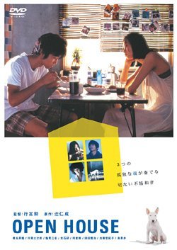
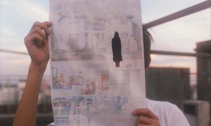
Open House (1997)

Open House is a very pretty film, from its close-ups to panning shots, it's fascinating how they experimented with different points of view, like a flying insect buzzing around the room and the movement of someone swinging back and forth on

a playground swing. I was enchanted by the visuals, atmosphere and lighting effects which had a floral dream-like feel to them, it reminded me of Wong Kar Wai's works. I'm particularly fond of the scene when firework sparks fall on thebalcony and on multiple occasions when the glow from a small lamp floods a dark room with warm pastel colours.

I would describe this film as the depiction of loneliness bathed in pools of sunshine.
Screenwriter & Director: Yukisada Isao
Cinematographer: Noboru Shinoda

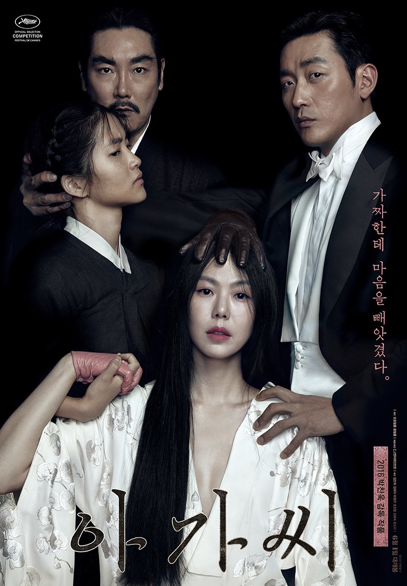
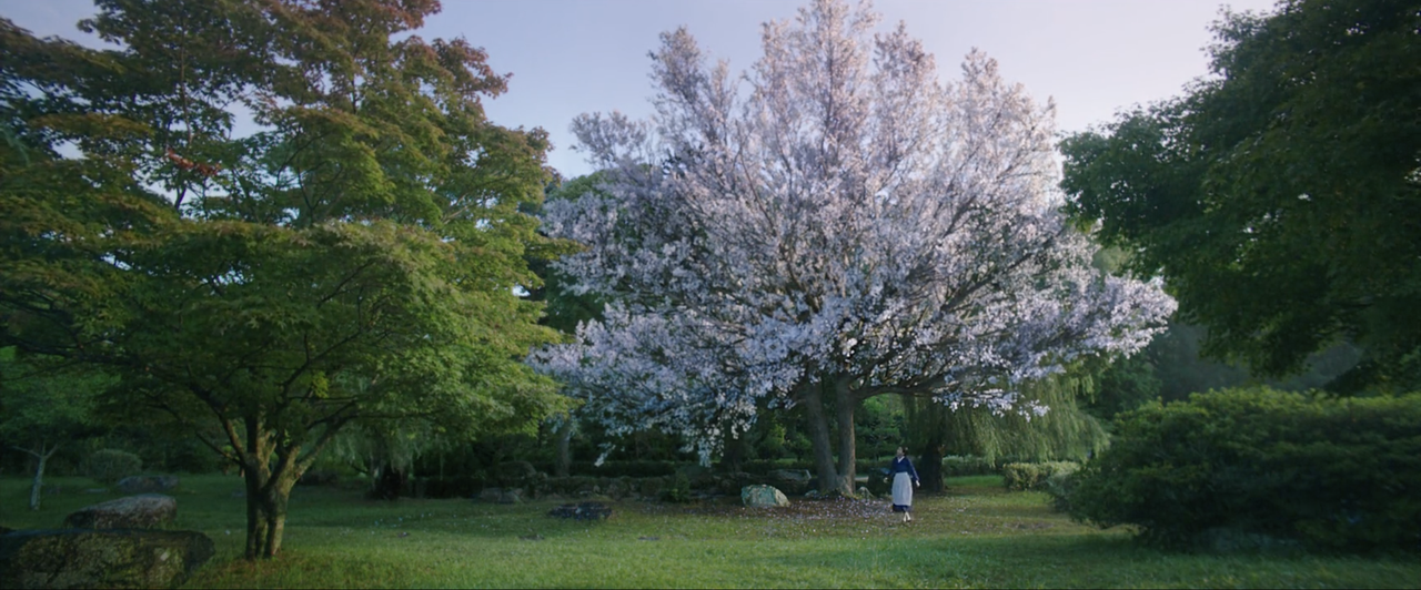
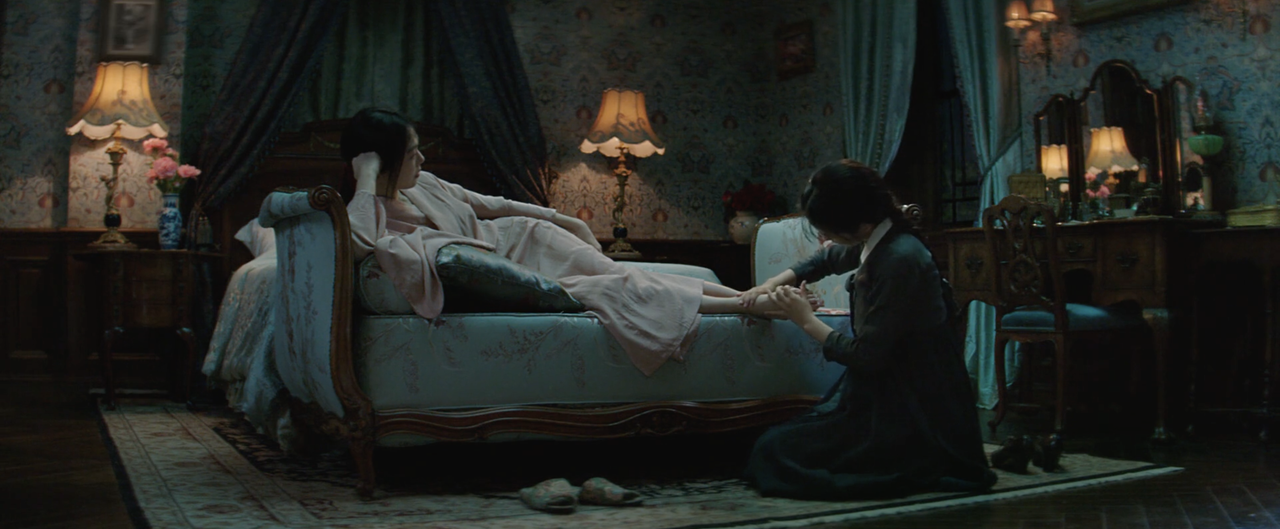
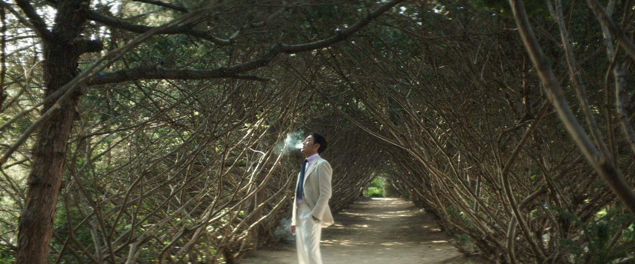
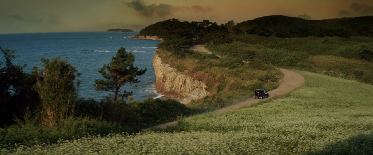
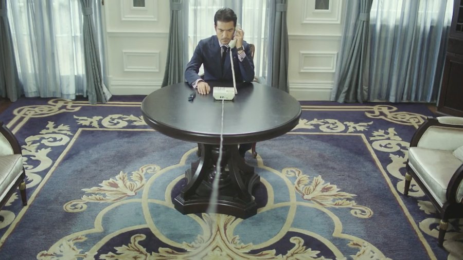
Many stills look like actual paintings, and occasionally, they actually are. When it comes to the overall composition of a scene, it's truly shot like a work of art, with everything from camera positioning to symmetry to

lighting perfectly drawing one's eye to the centre point.

The attention to detail is extraordinary, Park Chan Wook and his team definitely have mastered the formula of creating a visually
appealing scene.

Its striking locations and beautiful architecturally imposing mansion help make The Handmaiden such a visually stunning film from start to finish.
Screenwriter & Director: Park Chan Wook 
Cinematographer: Chung-hoon Chung

SUMMER: bright


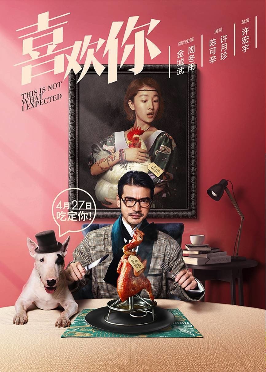
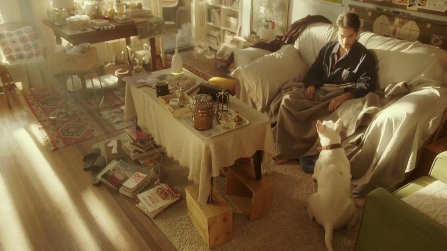
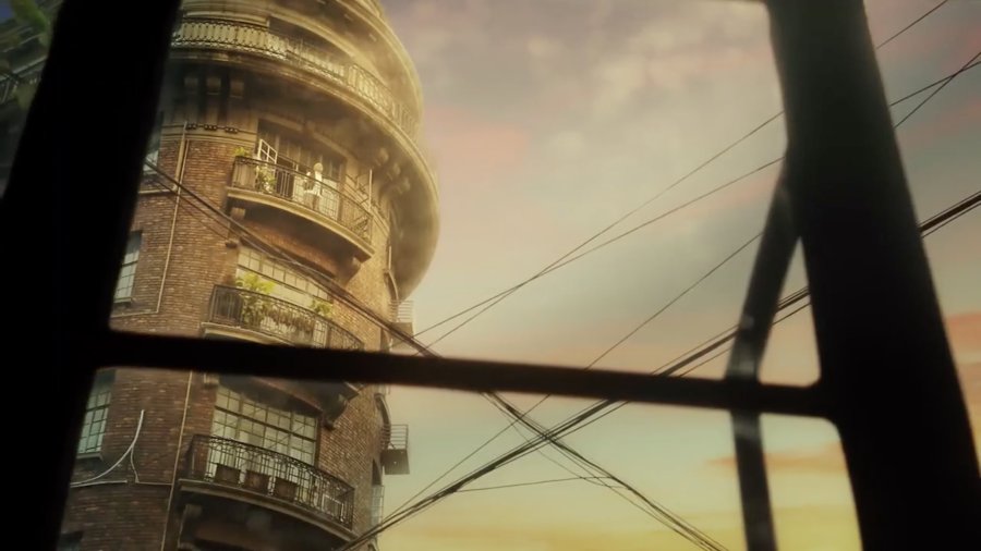
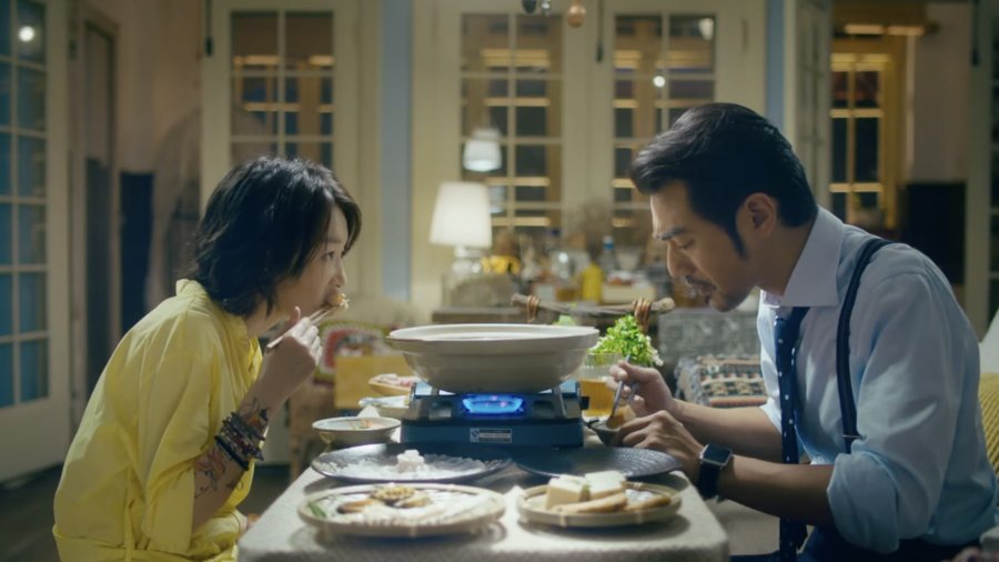
While it may not have the most mind-blowing cinematography, it's certainly shot beautifully, with pastel colours taking over the screen. It's truly a feast for the eyes. The visuals alone make me feel all warm and fuzzyinside, it's such a delight to watch.

The representation of food will without a doubt get you hungry while watching - I could almost smell the food. Everything looks delicious and is
uniquely displayed.

The use of warm tones and colour grading from mixtures of blues, yellows, and pinks wonderfully compliments the film's vibe; a cheesy lighthearted romance for foodies!
Director: Derek Hui
Cinematographers: Yu Jingping and Zhao Xiaoshi

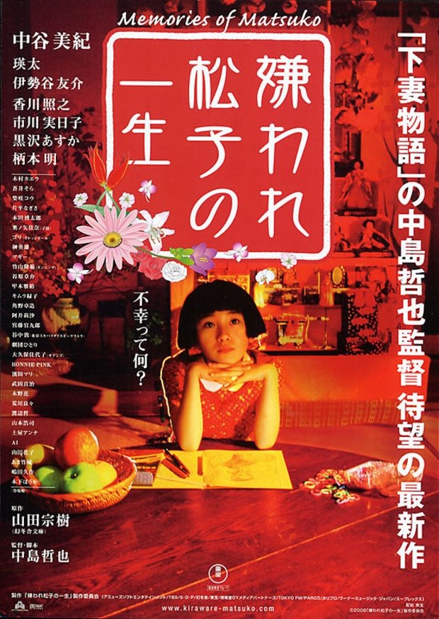
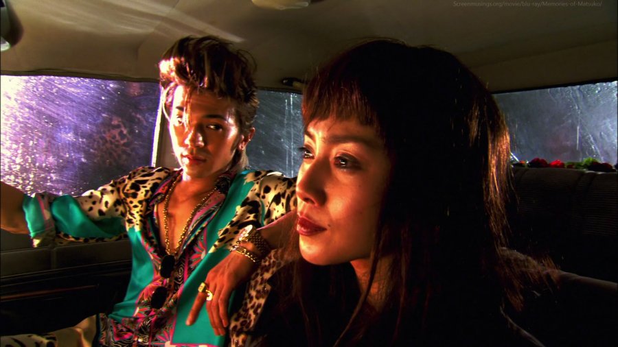
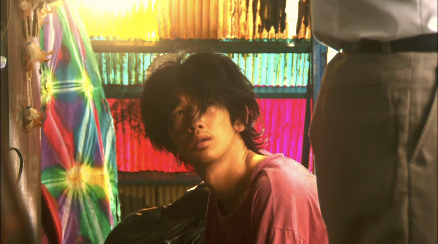
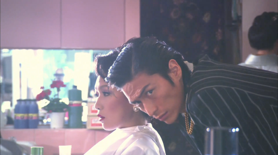
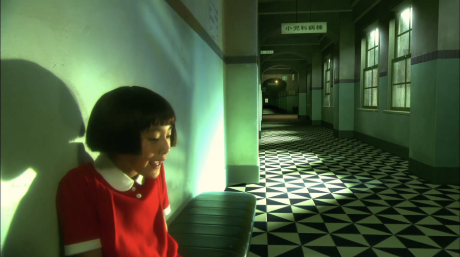
The film is presented in a dreamlike candy-coloured wrapping, with super bright and overexposed visuals (such as blinding lights glinting through windows). Nakashima allows the feverish pacing and aesthetics to hide the destructiveplot. He captures a pop-art style, mixed with some anime-like imagery, from drawn birds to artificial meadows covered by flowers. It’s no doubt that he has an incredible eye for detail, even in the smallest of things.*Zoom in* appreciation for the very attractive men cast in this film

Screenwriter & Director: Nakashima Tetsuya
CinematographerMasakazu Ato


Hong Kong film director, screenwriter, and producer
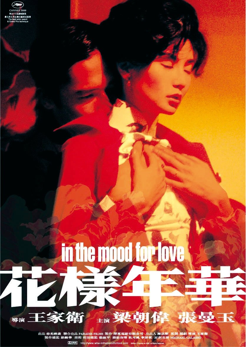
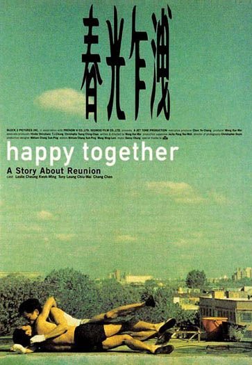
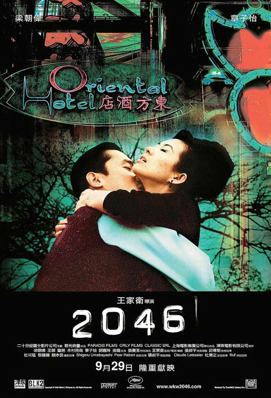
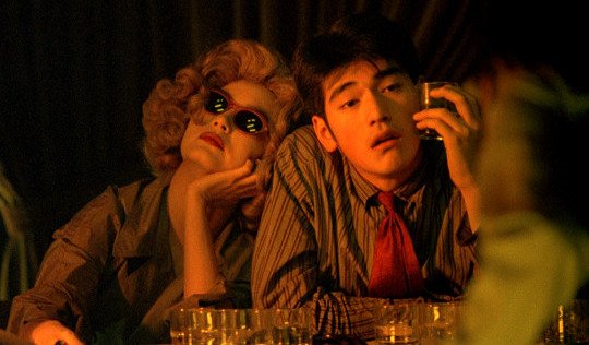
With his nonlinear narratives, pitch-perfect music, and vivid lush cinematography, Wong Kar Wai has established himself as the master of melancholy romance and one of the defining auteurs of contemporary cinema. I'm sure you've seen at least one of his filmsfloating around somewhere, with those bold saturated colours, his signature style is hard to go unnoticed. Wong has written and directed films that have charmed audiences and critics alike as well as inspired countless other filmmakers with their artistic choices.Fallen Angels (1995) was my first Wong Kar Wai film, which I remember being a wild experience. I didn't quite understand what was going on, but that's what started my love for Kaneshiro Takeshi so it holds a special place in my heart, and so do all of Wong's films!
Honourable mentions
In The Moon For Love (2000)Fallen Angels 
(1995)

Happy Together
(1997)
2046 
(2004)
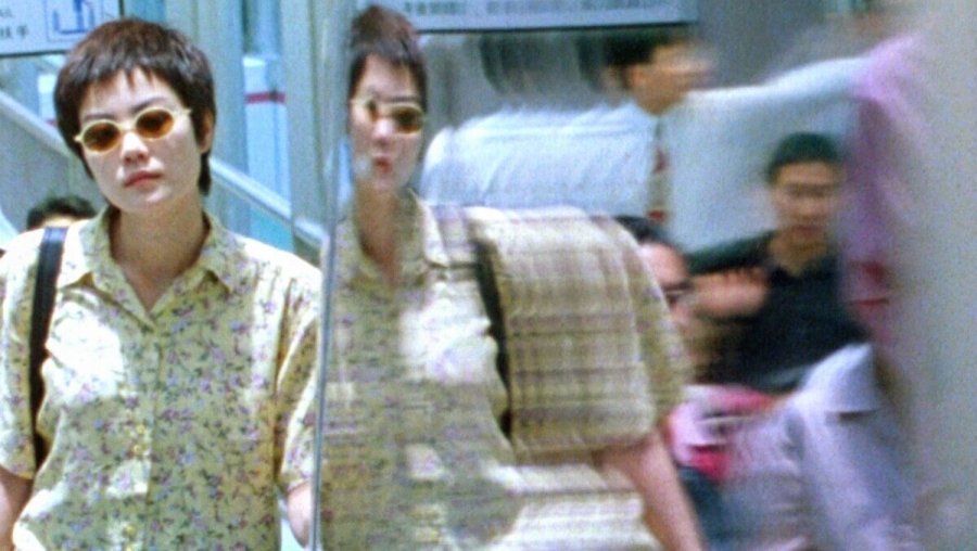
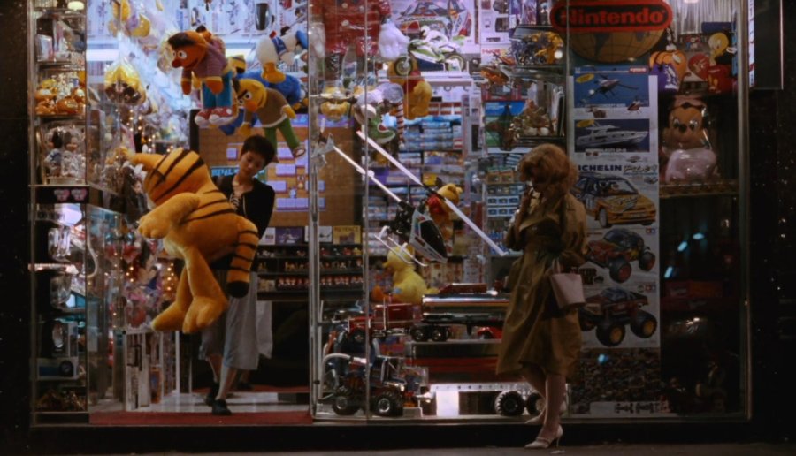
Chungking 
Express (1994)

Chungking Express starts with a fast-paced focus blur running scene. The use of skilled pan, tilt, and zoom is rather entrancing and honestly a fantastic way to immediately get an audience engaged.Wong Kar Wai's use of visual effects, from freeze frames to tracking objects, helped convey the loneliness, hopelessness, and frustration of the main characters.

I was completely
transported into the film, it visually and sonically washed over me like a fuzzy daydream.  The colours, the intimacy, the loneliness, the "California Dreamin", I am and forever will be in love with this gem.
Cinematographers: Christopher Doyle, Andrew Lau and Joe Chan

AUTUMN: full of colour

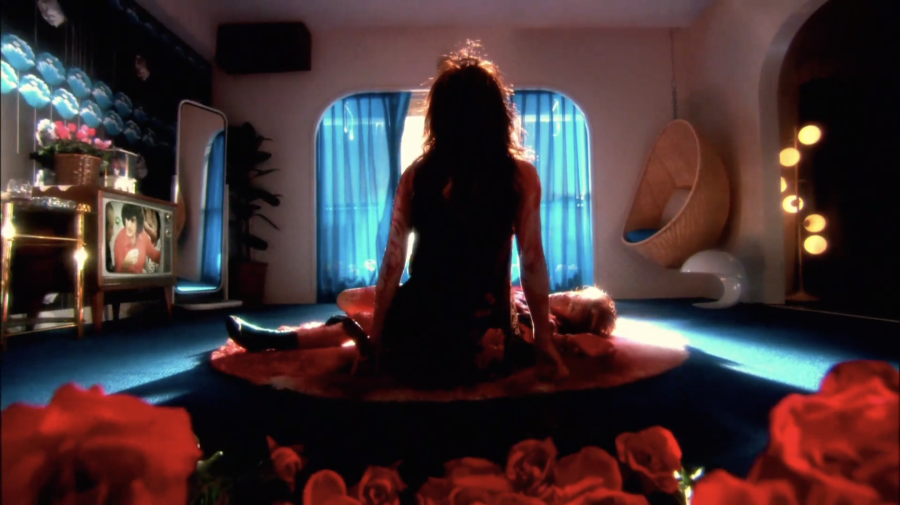
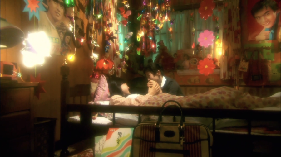
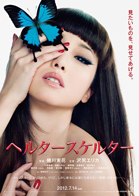
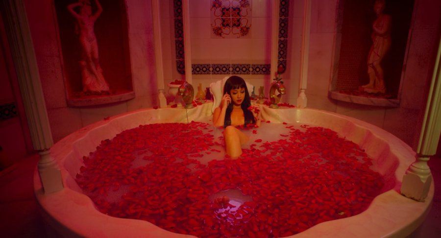
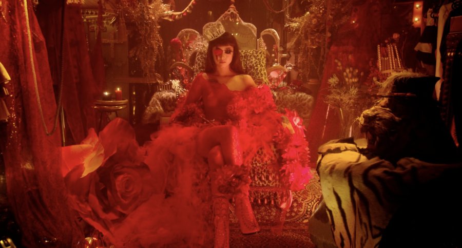
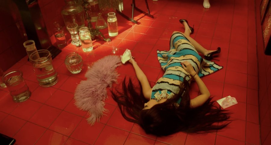
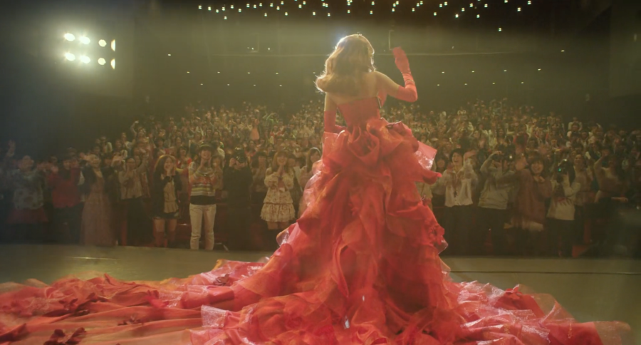
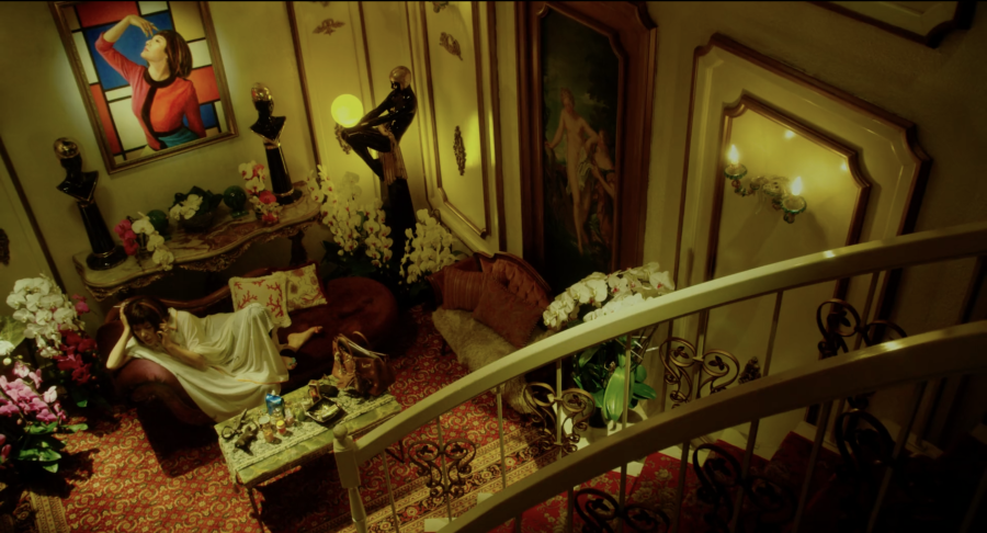
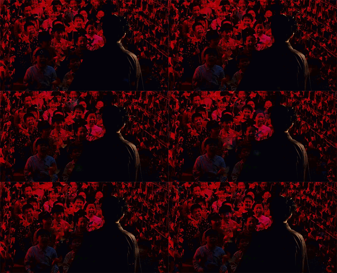
Helter Skelter is utterly compelling with its beautiful vibrant colours bursting out of each and every frame. The sets are elaborate and insanely constructed - my 8-year-old self would kill for a bedroom like Lilico's.Hands down the most bizarre lush film I've ever come across. It has a very individual and memorable style, never a dull visual moment. A lavish fever dream.

...Red is HER colour.
Helter Skelter best embodies 'Autumn', as the season is symbolic of decay, decline, and death (with associations of things being past their prime) and if you've seen the film, I'm sure you'd agree.
Director: Ninagawa Mika
Cinematographer: Daisuke Soma

Further Analysis  
(Possible spoilers warning)

This may be a stretch, but I feel like it's an interesting concept to talk about!

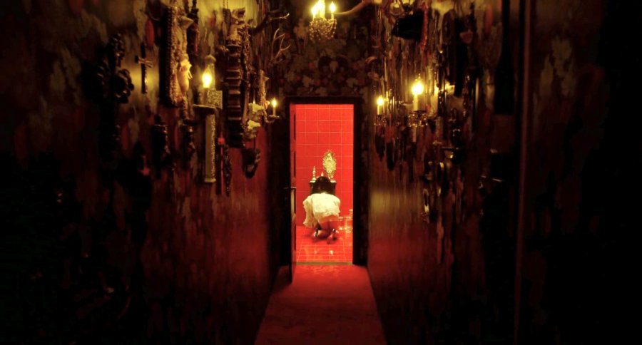
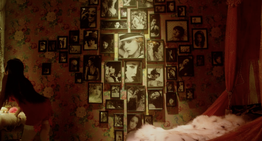
An example of the detailed scenery would be the power imbalance between Lilico and her "mama" (or better understood as a CEO figure), Tada Hiroko. Hiroko is portrayed as this god who (quite literally) "made" Lilico into who she is now - through full-body plastic surgery - which could be why Lilico calls her mama. It's particularly reinforced in the cinematography through scenes displaying each character's houses, with Lilico's being filled to the brim with religious objects like crosses, while Hiroko's is briefly seen with god-like sculptures and a painting of herself looking up to the sky - Lilico similarly has many self-portrait photographs surrounding her, but none are of her looking up, all picture her looking down or at the camera no matter the position she's in.

The use of crosses might symbolise Lilico's desire for peace in her life but instead, she drowns in her own beliefs, or that Hiroko is her god and she will protect Lilico (from the media, etc. - as a CEO should do), or I could be completely wrong, who knows, I'm just theorising at this point.

Lilico's hallway w/ crosses
Lilico's self-portrait wall
Hiroko's house
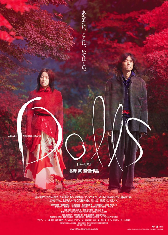
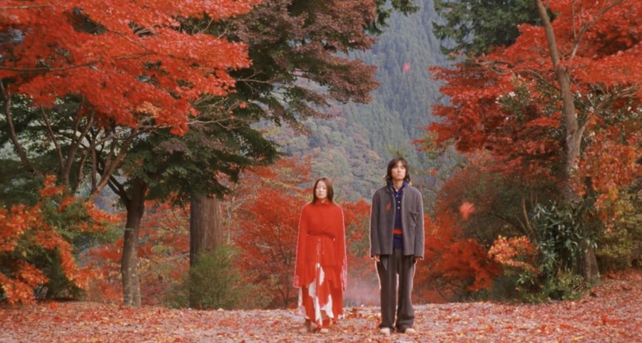
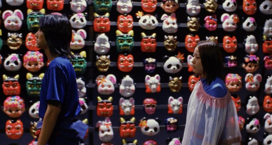
Easily the most stunningly colourful film I've ever watched. From the landscapes to the costumes, colours and patterns explode in your face. The flow of images you get here is truly unimaginablybeautiful. The film features a glimpse of each season, all of which produce magnificent almost surreal shots. If I were to describe this in four words, it would be, "a work of art."Dolls is like sitting on a beach, enjoying the scenery when a sudden wave of sadness runs over you.
Screenwriter & Director: Beat Takeshi
Cinematographer: Katsumi Yanagijima


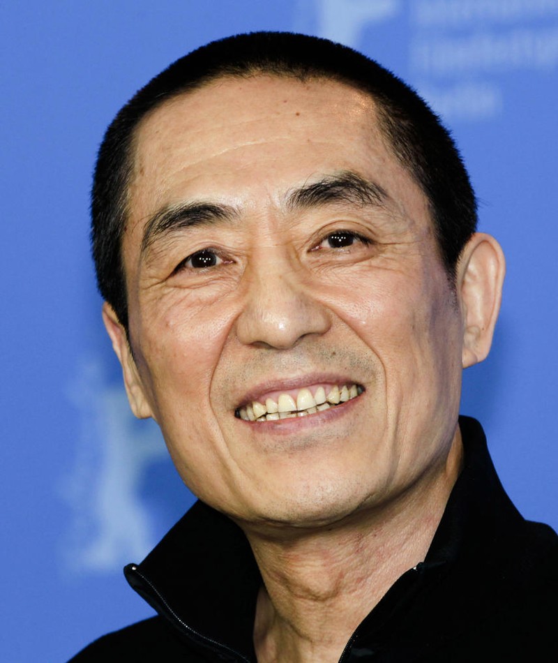
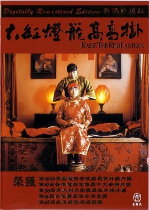
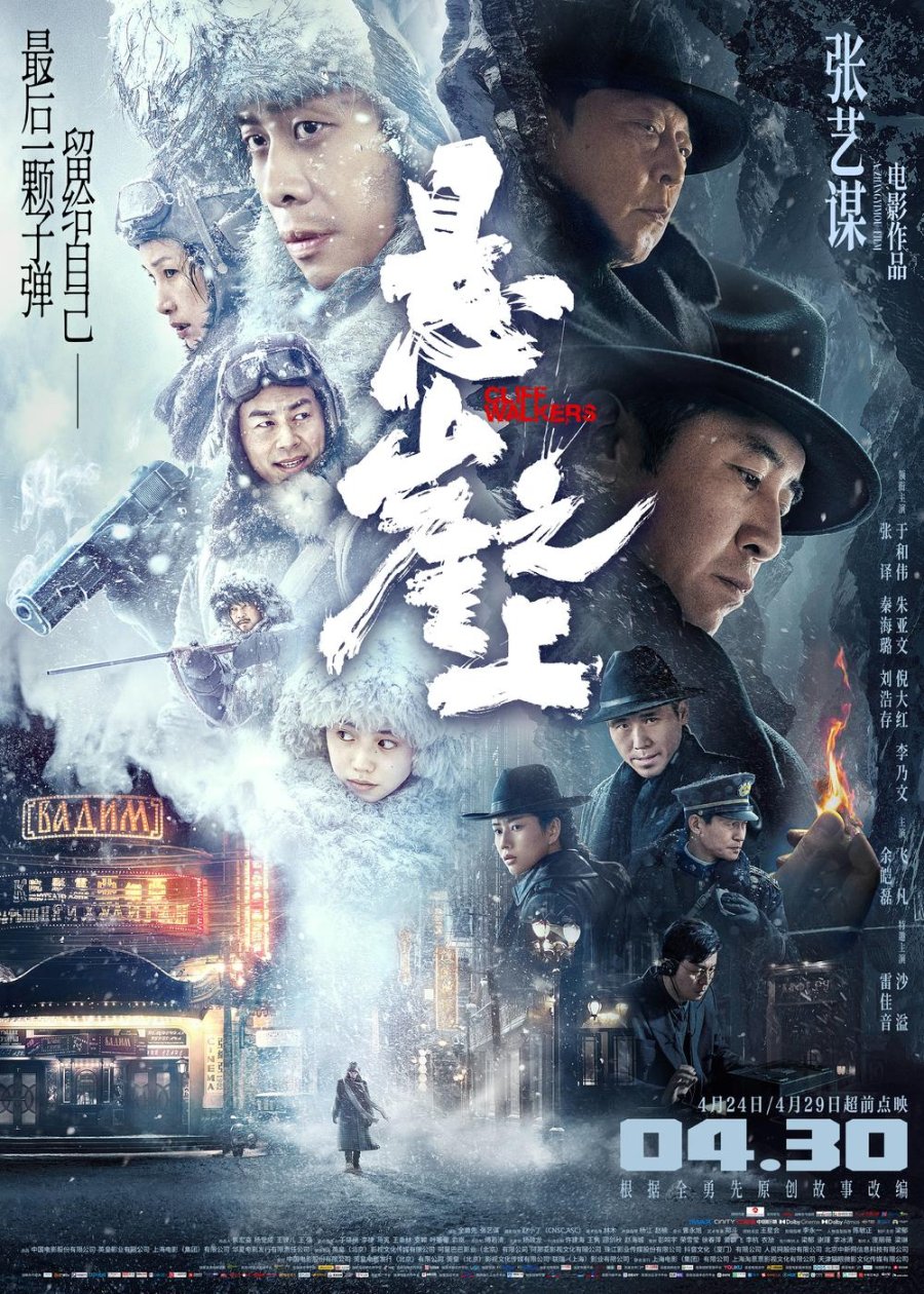
Chinese film director, producer, writer and actor, and former cinematographer
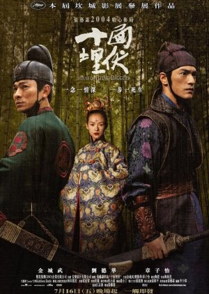
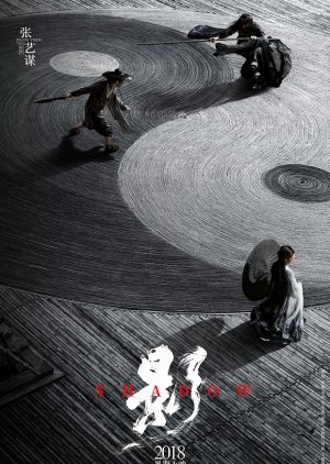
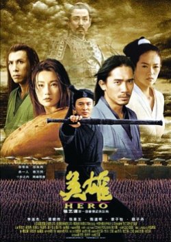
Viewed by many as one of the greatest directors of Chinese cinema and included within the 5th Generation of filmmakers, Zhang Yi Mou is highly praised for his aesthetically detailed visuals. As a former cinematographer, it's no surprise that Yimou’s films have a powerful visualpresence with almost every shot looking like an artwork. While I can’t say I particularly love Yi Mou’s storylines, his cinematography is on another level of beauty and are my go-to when I’m in the mood for eye-candy visuals. And for that, I truly admire and appreciate his work!Colour is one of the main mis-en-scene used in his films, mostly presented in shades of red, blue, and gold, like in Hero (2002). While he doesn't always follow this guide, an example here being Shadow (2018), it's certainly a characteristic he's known for.
Honourable mentions

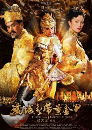
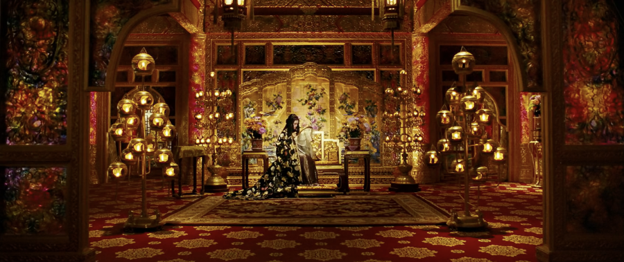
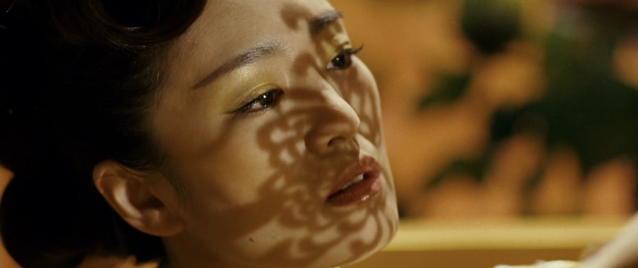
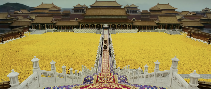
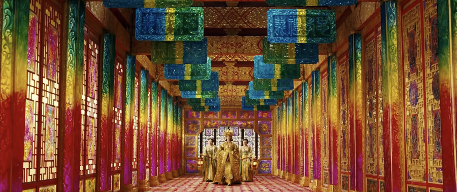
Curse of the Golden Flower is brought to life in shimmering shades of gold, inspired by rainbow and crystal pillars with golden fabrics and bead curtains at every corner you turn. I adore this colourful lolly-likeinterior, but to live there might be a bit much, imagine having any kind of headache and walking around…

The immaculate wide-angle shots capture the main characters wonderfully, despite the busy sets and
 hundreds of extras.

This has to be one of the gaudiest-looking films ever made.
Cinematographer: Zhao Xiaoding

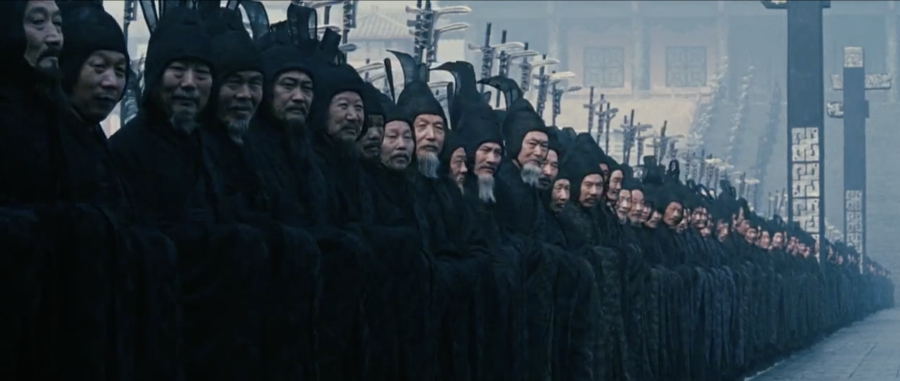
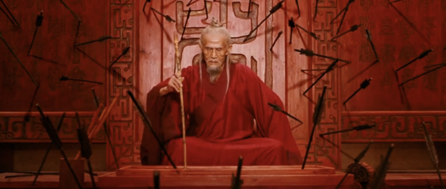
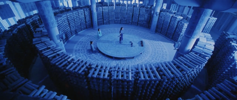
Hero is like an artwork brought to life! Each shot has obviously been thought out with a lot of care, evident from the breathtaking visuals. How colour is utilised to tell this story is bothvisually beautiful and psychologically intriguing. It left me speechless, to say the least.

Like most of the films in this article, these four screenshots
don't do it justice, the only way to truly see its beauty is by watching the film yourself!
Cinematographer: Christopher Doyle

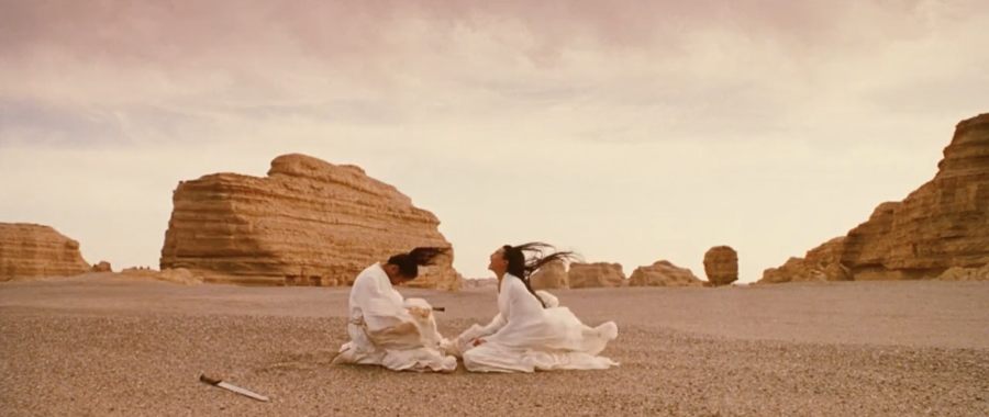
The intricacy put into each and every scene flowed beautifully in unbelievably gorgeous ways. I did some further research after completing the film and discovered that the cast and crew spent a lot of precious time creating such a masterpiece. It amazed me how much effort was put into everything, but it's no surprise considering the beautiful outcome!

One scene that stood out to me was the fight between Moon and Flying Snow which was filmed in a forest in Mongolia. The scene required all the leaves to be yellow - completely covering the trees and ground so the crew waited until they changed colour. Director Yimou Zhang had the crew separate the leaves into different piles, placing them at different lengths from the camera, hence demonstrating the detail put into each set.Last Sunrise (2019)

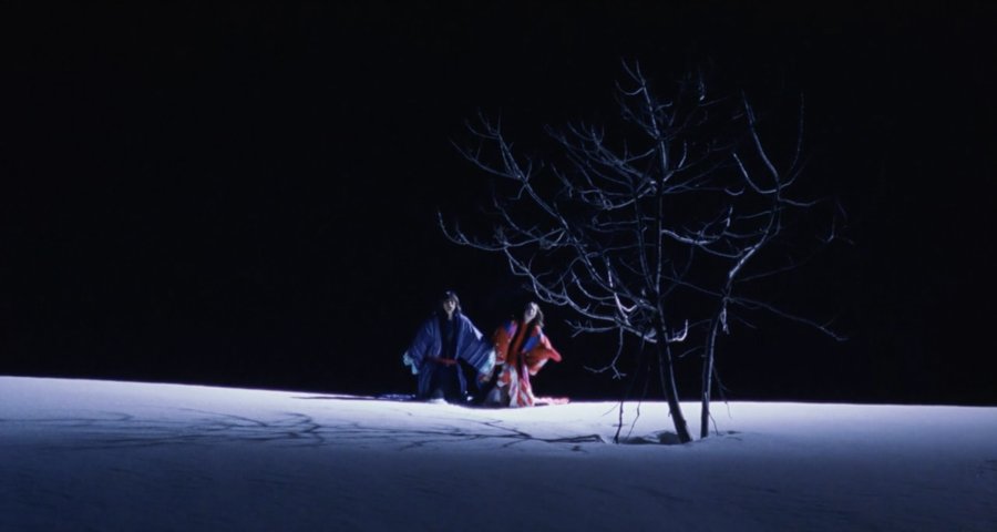
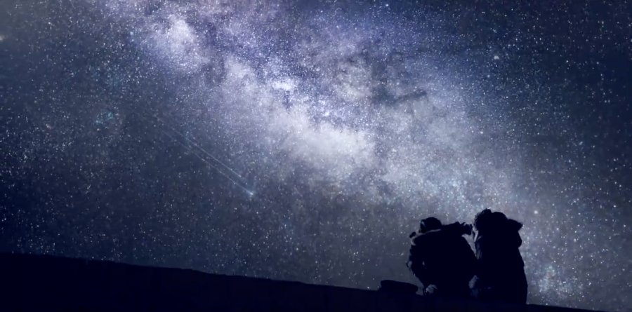
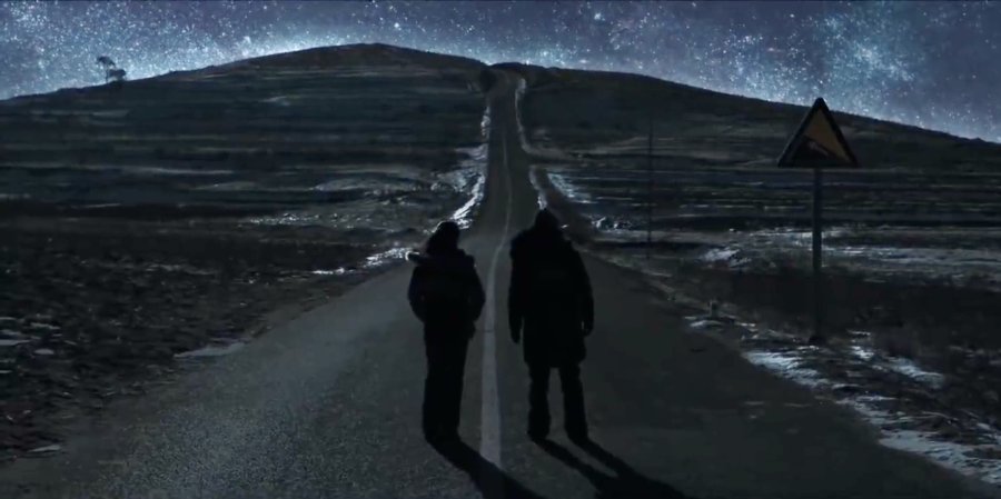
WINTER: dark/cold.

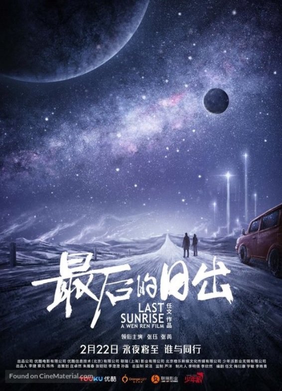
Last Sunrise (2019)
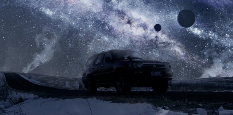
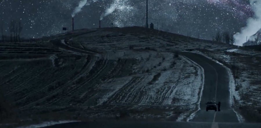
Last Sunrise's visuals shine more in the second half of the film as it beautifully illustrates what the earth might look like in complete darkness when the sun has disappeared and only the stars arethere to light up someone's path.

Although many scenes are isolated and far from any life, the stars manage to provide a sense of warmth amongst the dark coldness.

Who knew the end of the world could look so beautiful?

Director: Wen Ren
Cinematographer: Matthias Delvaux

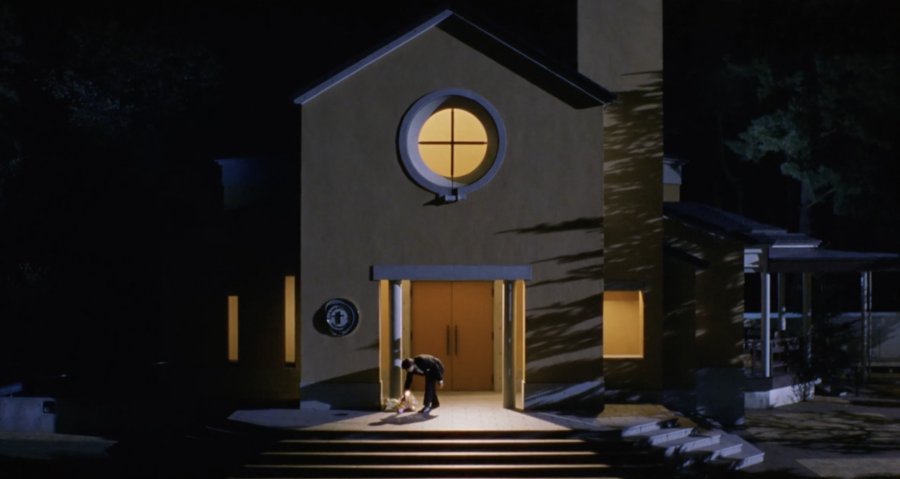
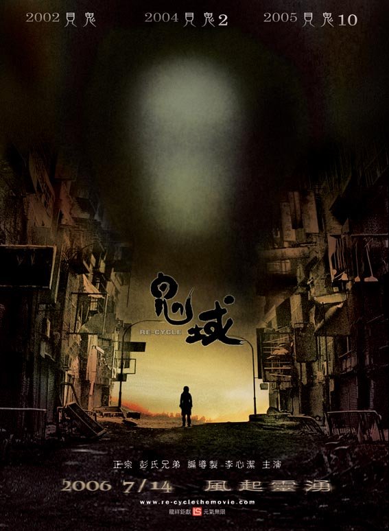
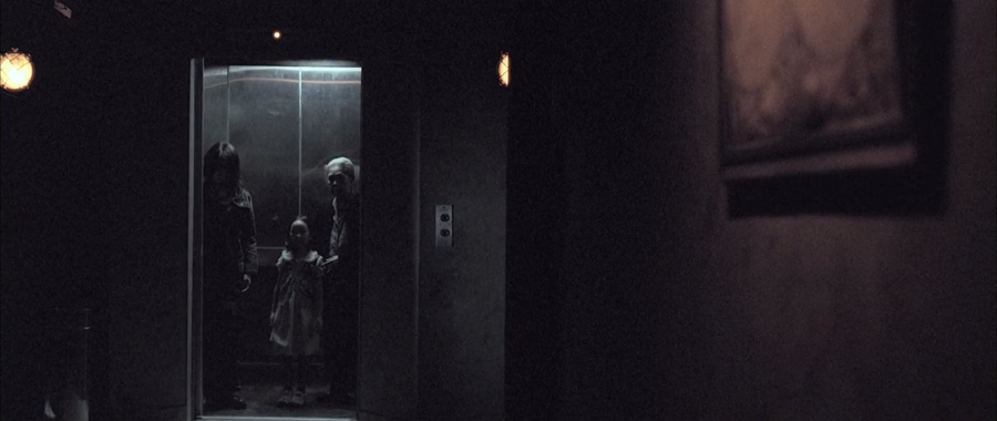
The cinematography is stylish, with superb camera work, strong lighting and very expressive use of colours from bright to dull. The CGI isn't amazing, but it's both functionaland aesthetically pleasing! The superb creative world-building helped keep the film fresh, appealing and most importantly, original.

Despite experiencing
multiple "heart attacks" (due to its horror aspects), I found the visuals really captivating and overall the film looked amazing.
Screenwriter & Director: Danny Pang and Pang Chun Oxide 
Cinematographer: Decha Srimantra

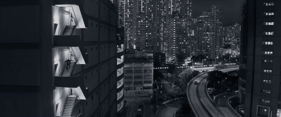
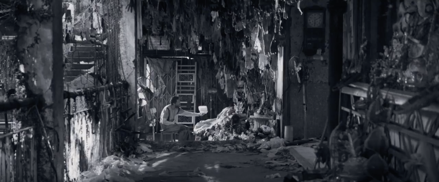
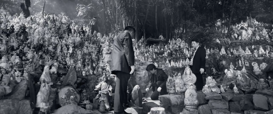
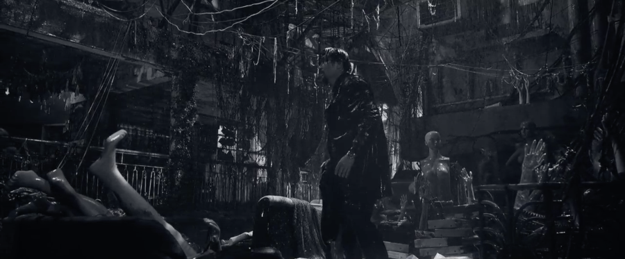
The fact that it was filmed in black-and-white not only helped elevate the modern noir look but also the contrast between light and dark, making everything a lot more unsettling and disturbing all while complimentingthe set - is a very smart artistic choice.

It has rather slick and atmospheric monochrome cinematography with excellent tracking shots, fluid movements, and interesting framing.
Most sets are jam-packed with objects and shot at night. The visual imagery in this film is very strong.
Cinematographer: Cheng Siukeung

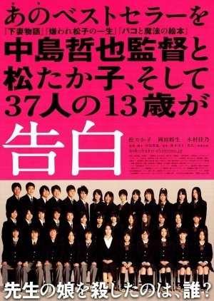
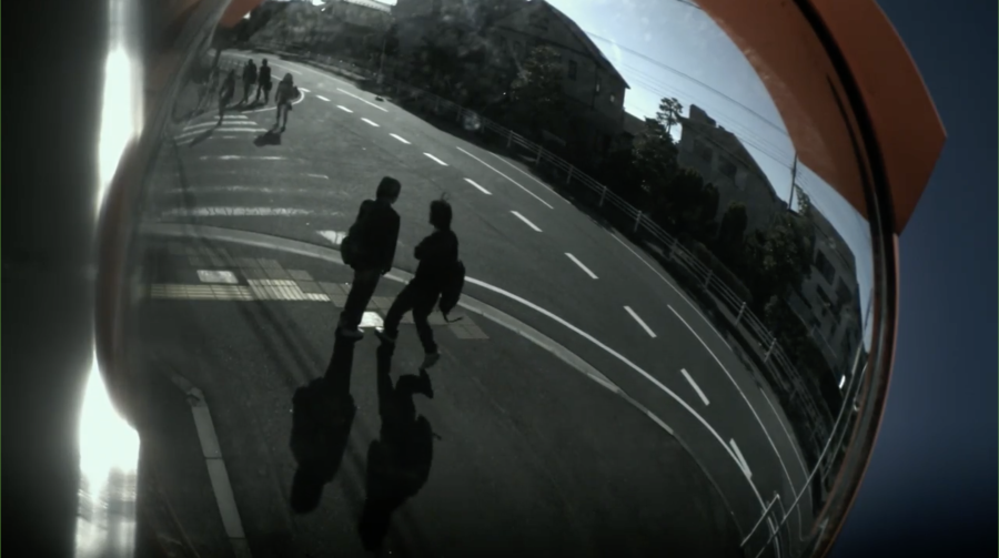
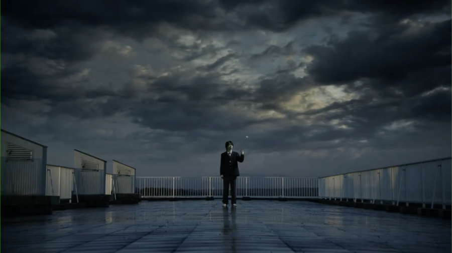
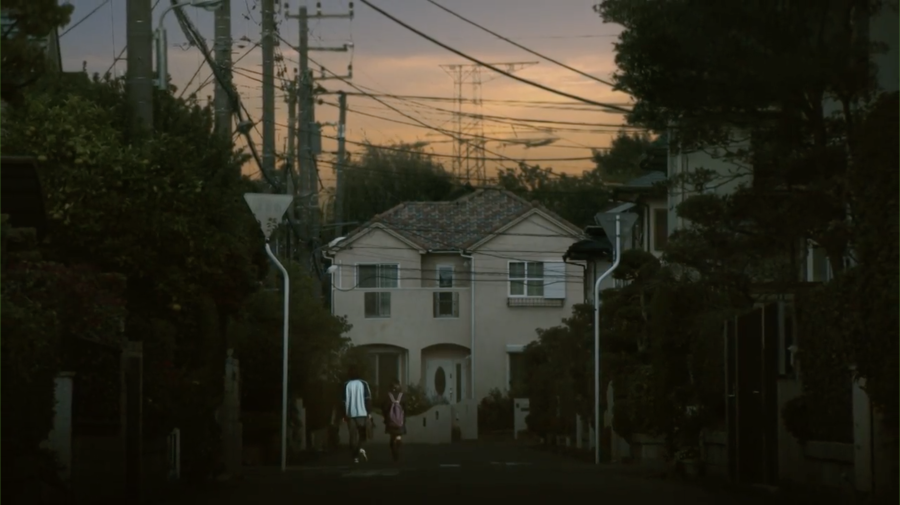
My favourite film on this list! Visually, I feel like Confessions is deeply underappreciated.

Nakashima's direction keeps you glued to every gorgeous frame thanks to its beautiful
cinematography. The trippy camera angles were so fitting.

With its constant visual metaphors and symbolism, it's evident that a lot of thought has gone into the film. The cinematography
is high on aesthetics and adequately conveys the required dark mood with clever lighting and colouring for effect. 
Screenwriter & Director: Nakashima Tetsuya
Cinematographers: Masakazu Ato and Atsushi Ozawa

Conclusion

One thing I've learnt from creating this article is to never judge a film based on its rating, because you never know, you may just find a masterpiece.

Thank you so much for reading, I hope this article was able to shed some light on films you have yet to discover and also provide you with a new perspective on the beauty of film!

So what are your thoughts? Should films be made purely for entertainment reasons or are aesthetics just as important? Share your opinions in the comments below!

This article could have been endless, and there are so many more films I plan to watch that I'm sure would make a perfect fit with this list, but I sadly don't have all the time in the world. If your favourites weren't mentioned above, please talk about them in the comments, I would LOVE more than anything to hear about your passion for a film or two.


Edited by:  BrightestStar (1st editor)
movie film aesthetic cinematography visuals